THINKINK Design – a boutique graphic design studio
THINKINK Design – a boutique graphic design studio established in 2015 as a solopreneurship has come a long way since its inception. THINKINK today has grown into a full-blown design company boasting of clientele on the continuum of Luxury Brands to MNC’s to start-up firms.
The company founder works on the philosophy
“You don’t have to ask a juggler which ball is the highest priority. Success is to do it all accurately each time”. This is reflected in the work ethos and client engagement policy adopted by THINKINK, Says the Founder/Owner – Hiral Dhruv.
Hiral started displaying her creative streak at a tender age, her canvas being the walls of her home, furiously covering all the walls of her home with sketches…
During her growing years it was evident that her creative skills if nurtured can be taken to the next level and thus started her journey… getting a formal education in design and graphics from Rachana Sansad College of Applied Arts and Crafts receiving a formal degree.
After dabbling with a couple of jobs with MNC’s as a designer having to work on monotonous projects, too much caffeine and sleep deprivation made her question the sanity of professional existence. This coupled with her keen desire to be independent led her to start her own venture ‘THINKINK Design’.
The company started with the founder single-handedly donning many hats including creative head, lead designer, sales, PR, admin et al. The initial years were filled with struggles around finding business, maintaining profitability and retaining the creative team while trying to expand THINKINK as the one stop shop for all design needs. The advertising and design industry is ruthless replete with many large players and making a mark for a small player is seldom easy.
It was the steely determination and talent on the part of the founder that has helped THINKINKnot only to survive but blossom creating a niche for herself. Today THINKINK has a team comprising of creative designers, coders, content writers managing end to end projects.
Her strong sense of design and aesthetics coupled with creative visualization and attention to details soon got her appreciation of clients. Her vision is to continuously improvise and maintain a level of perfection along with her quirky creative touch. She has been recognized for being able to turn out projects with amazing speed and agility meeting tight deadlines.
“THINKINK owes all its success to the clients and would like to thank them for reposing their faith in the capability of the team, recognizing the hours of determined efforts expended and steadfastly supporting them at each stage of the company’s growth”, Says Hiral.
Clientele :
Once a startup herself she has been working passionately to provide wings to startups by providing them an entire suite of identity creation and brand management solutions. THINKINK’s diverse clientele includes brands like Audi, Cipla, HDFC Realty, Piramal Enterprises, F&B’s – Oye Kake, Vakeup , Varitea Lounge, Tanatan Work.
Hiral believes in the adage “Let my work do the talking”.
Below are some of the milestones in her journey
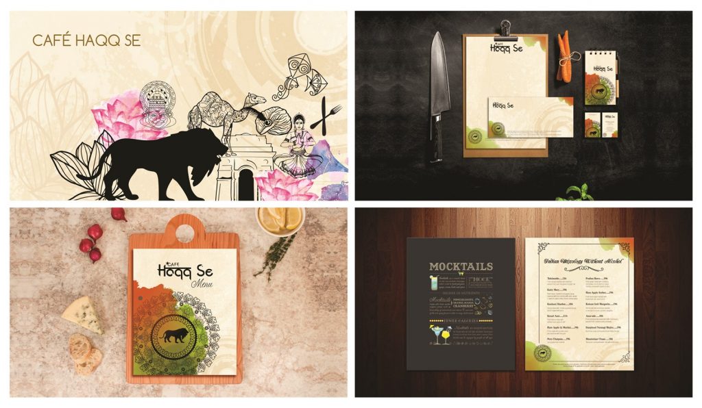
Café Haqq Se: Indo-fusion Restobar (Lower Parel, Mumbai)
CLIENT REQUIREMENT: We were commissioned to take charge of the overall branding of the café which included the responsibility of designing a monogram, personalizing their stationery and crafting the menu. Following the principal theme of the café, they incorporated a color palette derived from the national flag of India. You will be reminded of your Indian roots through the various design elements and hues.
MONOGRAM: Continuing the theme of celebrating India, the monogram is styled on similar lines. Taking inspiration from the national symbols of India, the monogram reflects the pride of our nation. With the highlight of the café, that is the Make in India Lion, at the center, the monogram is a well-balanced concentric composition.
MENU: With a graphical and illustrative design approach, the menu for the café breaks away from the conventional monotony that is associated with a menu card. The right side has the items listed methodically with their monogram printed at the bottom left corner and following the same color palette as the rest of the café. The left side is a grey colored canvas for the artistic representation of interesting facts about India. On the whole, the look and feel of the menu is a prompt reminder of the Indian retro style.
Educate Girls: NGO
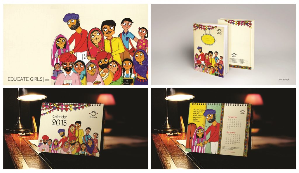
Educate Girls, as the name suggests, is an NGO working hard to educate the girl child, a cause that we truly believe in. Taking a cue from this strong central theme of women empowerment, we designed brand resources like calendar, notebooks, annual reports, infographics and Space graphics. The doodles, vectors, and graphics embody illustrations synonymous to hope, knowledge and aspirations, against a red background to give out a very strong social message. As we design a new theme for each year, the appearance changes but the soul remains.
Hungry JD’s: Food on Wheels (Mumbai Suburbs)
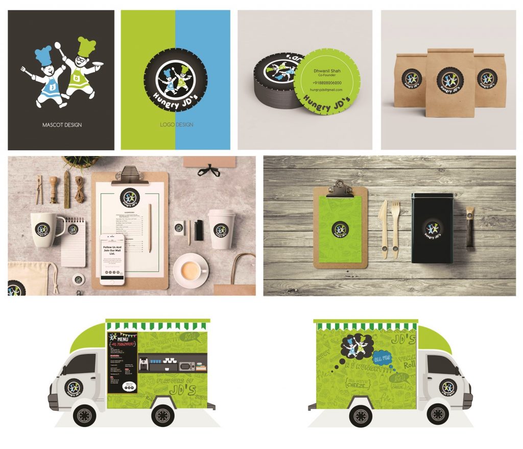
CONCEPT: With a unique concept of food on wheels, the fast-food van of Hungry JD’s is now seen on the roads of Mumbai. Growing popularity has led to their expansion and given rise to the need for pattern communication and branding for all its franchises. This is where we stepped in.
We started restructuring the brand and designed a groovy look for the van and collaterals such as menu, packaging etc. The principal thought governing the design was to create a striking theme and extend the same in all formats (Food Vans, Café, Takeouts). We decided to highlight their brand color – green, and use it as a backdrop. With this in mind, the essence of fast food was captured in a collage of complementary elements against a fresh green background, to create a strong visual identity.
Hungry JD’s was represented by two mascots designed as replicas of the owner’s identity. The logo is a wheel symbolizing the concept of food on wheels with the two mascots at its center. The menu is playful and designed in a format that is easy to handle and durable. The success of our design is the frisky and candid graphic quality that forms an instant connection with viewers, leaving a mark on their minds which makes it easy to recognize the brand.
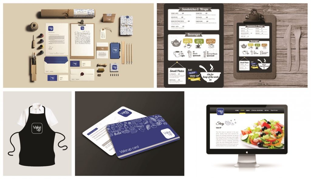
Vake Up: an upscale café (Ahmedabad)
A wake up call for everyone, Vake up is a feel-good eatery in Ahmedabad to grab a quick and nutritious bite. With the health quotient in mind, we designed the entire branding for them, including logo, stationery, menu, packaging and space graphics. The logo is as minimalistic as the theme of the restaurant with a collage of modest line diagrams juxtaposed against a vivid background. The menu captures the essence of a wholesome take on food, with colloquial fonts and colors.
Advice for budding entrepreneurs
Never forget “Unless you are royalty, most successful ventures were once struggling startups. Persistence, perseverance, self-belief with a little bit of luck will take you where you want to go.”
Funding Model
As of Now, We are Bootstrapped. We Can Plan for Funding and investment in near Future, Says Hiral .
Company Connect
Website: http://thinkinkdesign.in/
FB Page: https://www.facebook.com/THINKINKDesign/?ref=aymt_homepage_panel
Email: hiral@thinkinkdesign.in
Hi, This is Scoopearth’s admin profile. Scoopearth is a well-known Digital Media Platform. We share Very Authentic and Meaningful information based on Real facts and Verification related to start-ups, technology, Digital Marketing, Business and Finance.
Note: You can reach us at support@scoopearth.com with any further queries.
Linkedin Page : https://www.linkedin.com/company/scoopearth-com/
